To thank its 5,000 and more Facebook fans, Minimal USA shared with them a new project recently completed in the Upper East Side, New York.
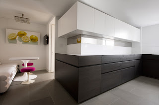
The lower cabinets in brown oak are topped with a white
Caesarstone countertop, while the upper cabinets are in glossy white lacquer. The backsplash,
in the same material as the countertop, is instead interrupted by a stainless steel sheet which, running
along the left side of the kitchen, creates a mirror effect that confers
amplitude to the room.
The cabinets’
groove is an elegant solution to keep the overall design of the kitchen uniform
and clean. Its 45 degree edges allow an easy opening of the units, without resorting to the use of handles.
The 2
inches-low kickplate is the design complement of the user friendly
character of the kitchen. Its height in fact, not only gives 15% more of storage space, but also
creates a real floating effect for
the cabinets, turning the kitchen in a monolith
sculpture, thanks also to the mitered edges of the units.
.jpg) |
| VERVE Kitchen Picture by Federica Carlet |
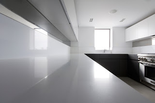
In this U-shaped
kitchen, the left side was
designed as a storage and working space,
thanks to the top in Caesarstone that flows along the entire wall. In the center area, the sink and dishwasher, concealed with a panel in the same
material and color of the cabinets. The right
side has been reserved at the gas
range, topped by other glossy white lacquer cabinets and, just below of
them, the stainless steel sheet completes the design.
.jpg) |
| Close up of the white Caesarstone countertop Picture by Federica Carlet |
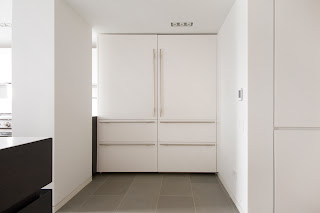
The right space at the entrance of the room, was filled with two majestic columns in glossy white lacquer panels with stainless
steel handles, which hide refrigerators
and freezers. Always on the right side, in a niche at the entrance, a pantry
has been concealed in the wall which, camouflaging itself, provides additional
storage space.
.jpg) |
| Front view of the paneled fridges and freezers and the pantry Picture by Federica Carlet |

No comments:
Post a Comment