Monday, January 20, 2014

Minimal USA on ArchDaily

When at first Minimal USA has been contacted by ArchDaily for showcasing its products through their new online catalog, the Italian Company was absolutely happy and honored to have been chosen.

Now that Minimal USA has finally uploaded all its products on the world's most visited architecture website, it is happier and more honored to share this great news with its public.
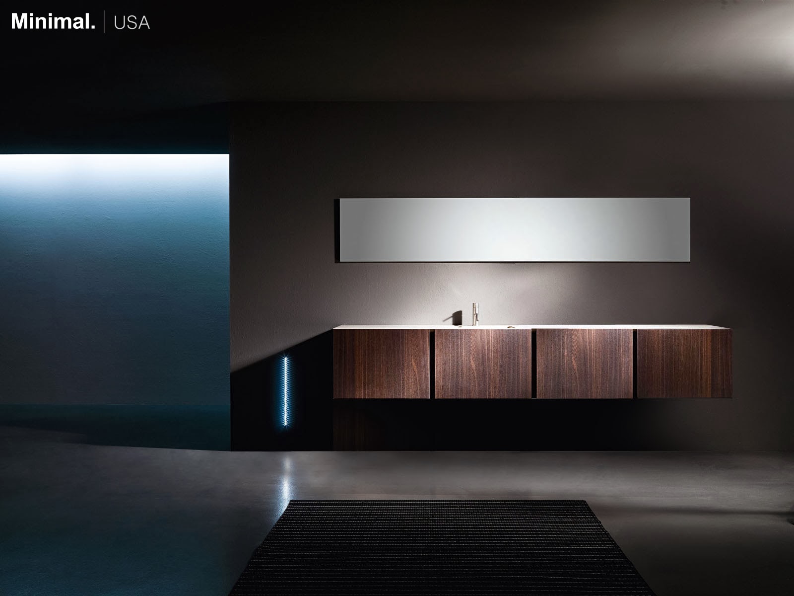

Minimal USA Contemporary Bespoke UNITS Bathroom
UNITS Bathroom


Being part of one the most well known architecture website, gives Minimal USA not only the opportunity to reach more prospective clients, but also to set itself into the restricted list of leading companies in its industry.
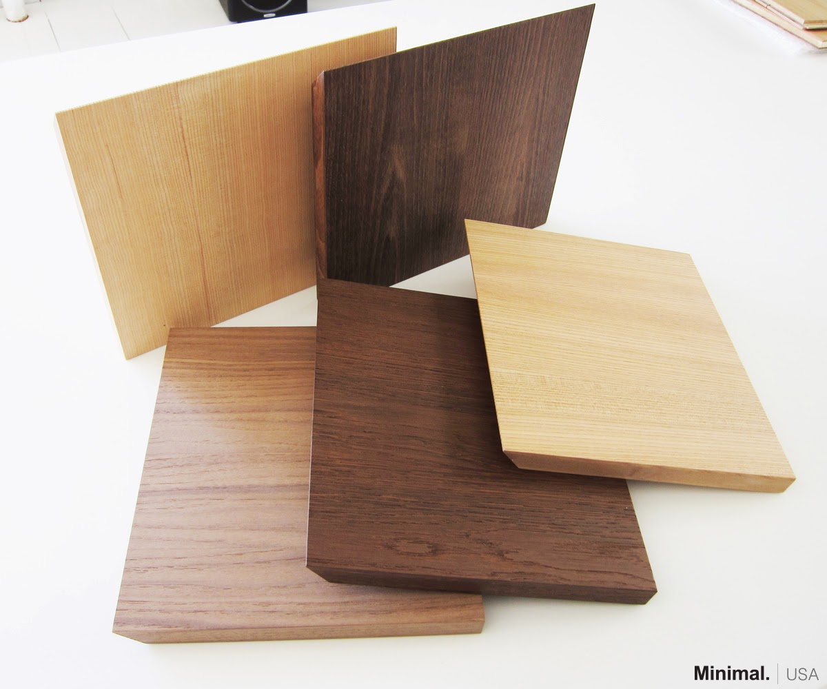

Minimal USA New Premium Wood Doors
New Premium Wood Doors


For Minimal USA's long-term fans this will be another way to find its products online and, for future fans, this will be one of the possible ways to get to know, love and recommend Company's products to family and friends.


Minimal USA Custom Contemporary GLAM Kitchen with Sliding Top
GLAM Kitchen with Sliding Top


So do not miss this opportunity. Go and check Minimal USA collections of kitchens, bathrooms and the new premium wood doors on ArchDaily and share these products one more time, or for the first time, on the Internet.
Friday, September 6, 2013

5,000 and more thanks!!!

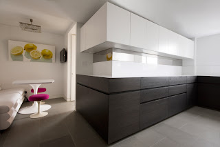
To thank its 5,000 and more Facebook fans, Minimal USA shared with them a new project recently completed in the Upper East Side, New York.

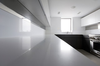
The lower cabinets in brown oak are topped with a white Caesarstone countertop, while the upper cabinets are in glossy white lacquer. The backsplash, in the same material as the countertop, is instead interrupted by a stainless steel sheet which, running along the left side of the kitchen, creates a mirror effect that confers amplitude to the room.
The cabinets’ groove is an elegant solution to keep the overall design of the kitchen uniform and clean. Its 45 degree edges allow an easy opening of the units, without resorting to the use of handles.
The 2 inches-low kickplate is the design complement of the user friendly character of the kitchen. Its height in fact, not only gives 15% more of storage space, but also creates a real floating effect for the cabinets, turning the kitchen in a monolith sculpture, thanks also to the mitered edges of the units.


Minimal USA VERVE Kitchen UES Private Residence
VERVE Kitchen
Picture by Federica Carlet


In this U-shaped kitchen, the left side was designed as a storage and working space, thanks to the top in Caesarstone that flows along the entire wall. In the center area, the sink and dishwasher, concealed with a panel in the same material and color of the cabinets. The right side has been reserved at the gas range, topped by other glossy white lacquer cabinets and, just below of them, the stainless steel sheet completes the design.


Minimal USA VERVE Kitchen UES Private Residence
Close up of the white Caesarstone countertop
Picture by Federica Carlet


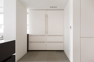
The right space at the entrance of the room, was filled with two majestic columns in glossy white lacquer panels with stainless steel handles, which hide refrigerators and freezers. Always on the right side, in a niche at the entrance, a pantry has been concealed in the wall which, camouflaging itself, provides additional storage space.


Minimal USA VERVE Kitchen UES Private Residence
Front view of the paneled fridges and freezers and the pantry
Picture by Federica Carlet


Go and check the entire project on Minimal USA official profiles on Facebook and Pinterest.


Wednesday, July 17, 2013

How to maximize the functionality of a studio apartment!

Minimal USA has shown the flexibility of its products, designing the kitchen and the wardrobe for a studio in Columbus Circle area and, at the same time, has proved once again that luxury not only belongs to big spaces.

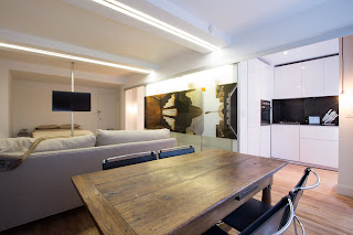
In this 650 square feet studio, Minimal USA has designed its tiny kitchen of 27 square feet and the closets of 16 square feet, whilst Studio Bichara, the Italian interior design company that partnered with Minimal USA for completing the project, has developed the design of the bedroom area and the living room.


Minimal_USA_INDEX_Kitchen_Columbus_Circle_Studio
The studio
photos by: Federica Carlet


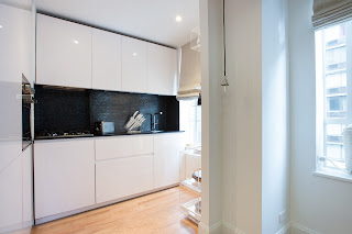
The kitchen features glossy white lacquer cabinets and doors, while the countertop is made of black absolute Caeserstone. The black glass mosaic backsplash completes the elegance of the design creating silver reflections. The fluidity of the design keeps on the left side of this tiny kitchen thanks to the glass oven put at the same height of the backsplash and the paneled refrigeration column closes the space.


Minimal_USA_INDEX_Kitchen_Columbus_Circle_Studio
View of the 27 square feet kitchen


At the opposite side of the kitchen, closed to the entrance of the studio, Minimal USA designed the closet. These doors in glossy white lacquer, not only are a sleek solution, but are also functional, since they can slide sideway, creating light plays that give depth to the small area that takes to the bathroom.


Minimal_USA_INDEX_Kitchen_Columbus_Circle_Studio
Closets by Minimal USA


Studio Bichara has designed the rest of the studio, creating special glass doors that slide all over the length of it, becoming doors for the closet area and for the kitchen when opened and doors for the central boiserie when closed. The Italian interior design company has also designed a turning system that allow guest to comfortably watch television both from the couch and from the bed.


Monday, June 17, 2013

Minimal USA is Best in Design

RoomReveal, one of the most important home design photos websites for professionals, has announced the winners of its Spring 2013 Reveal Award Competition and Minimal USA is one of the Companies that have won the title of Best in Design.

The competition, open to all the members of the website, has been carried on from the beginning of the year until May. The winners has been chosen among thousands of profiles, based on the numbers of the nominations a Company received from other professionals and the quality of the projects shown.


Minimal USA is Best in Design
Minimal USA won RoomReveal's Best in Design prize


This prestigious prize confirms once again the quality not only of the products but also, and more important, of the design of Minimal USA that has now been officially proven also by architects and interior designers.

Visit and follow the official profile of Minimal USA also on RoomReveal to not lose any other projects of the company.